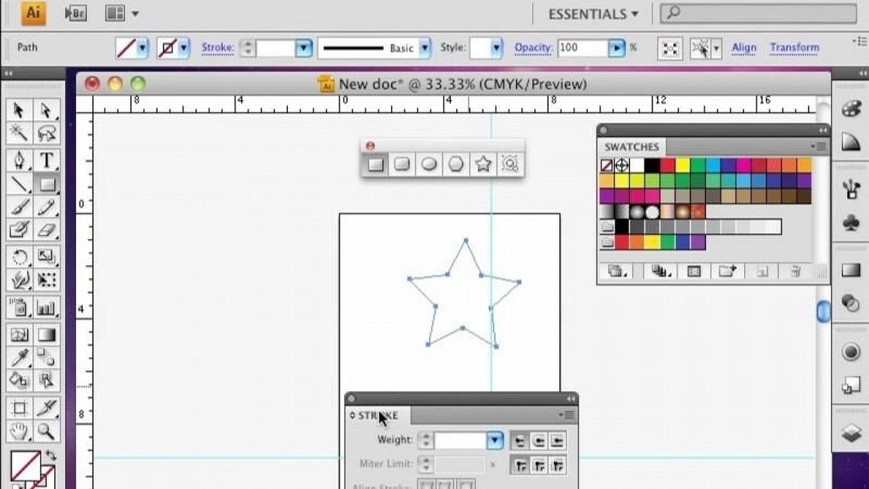
In this lesson, you will learn the principle of visual hierarchy. In graphic design, hierarchy refers to the placement of visual elements in order of importance. Hierarchy can be achieved through several of the means that you have practiced throughout this module. As a designer, you want to develop visual hierarchy to ensure that you're intended audience captures the most relevant information first so they will remember the most important parts of the message. Follow along with this lesson by creating a letter size document in Adobe Illustrator. The first and most obvious way to achieve visual hierarchy is by size. Let's create a group of circles, and make one of them much larger than the others. When grouped together, the largest circle appears to be most important. Your eye naturally tends to follow the largest element first, and then we'll go to the smaller elements. Let's get rid of large circle, and look at another way to achieve visual hierarchy. Select one of the smaller circles and change the color to red. While in a group, the red circle stands out, and is what draws our attention initially. Color is an excellent way to guide your audience through the composition. A third way hierarchy can be achieved is through majority. Create one large circle and separate it from the other group. If the other group has overwhelming numbers, those elements will draw the attention first. In design, this can be achieved through repetition. A fourth way we can achieve this is through perceived weight. Remember, darker elements have a heavier perceived weight than lighter elements. Select two circles and align them next to each other. Lower the opacity of one to 50%. Notice how the darker circle commands the attention first, and therefore appears to be more important. And a fifth method to achieve visual hierarchy is through alignment. Align five circles with each other and place them on the left side of the art board. Now, spread a few more of the circles to the right. Notice how the aligned circles have a more commanding presence and draw the attention first. Let's put this into practice with some typographical elements. One obvious example is one that we have done several times, and that would be name and title. Let's type "John Smith" in a thick font, such as Arial Black, and in all caps. Now let's put his title, owner, in a thinner font, and make it smaller. The name is the first thing that stands out, and what you will read first. How about if we duplicate the name John Smith multiple times and place them all together in a group? Nothing stands out. Select one. Change the color to red. Even if it's moved off to the side just a bit, it still draws the attention first. Now, let's try this with repeating elements. Type out one through 10, and in front of five, six, seven, eight, let's put a bullet point. The repetition of the bullet point highlights those numbers, and therefore gives them more importance. Type out the phrase, "The importance of visual weight." Now, highlight the word importance and make it a thicker font in bold. Notice how even though it's only one word, it visually weighs more than the rest, therefore, we notice it and make sure we pay attention to it. Alignment can be key. Type out a fictitious business name and address and make sure they are left aligned. By grouping these and aligning them correctly together, it signifies the importance. Color, weight, repetition, alignment, and size can all be beneficial for your design in terms of hierarchy. Take care not to abuse these principles. Using too many inappropriately may result in more confusion than recognition. In the next lesson, we will look more into specifics regarding alignment.