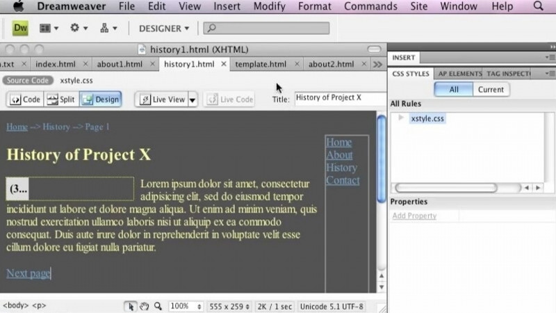
In this lesson, you are going to learn about adding media queries with the CSS designer in Adobe Dreamweaver. I have set up a Module 3 site. You can see in my Files panel I have Module 3. I connected this site to the lesson files for Module 3 with this video. And you can do the same by going to the site menu and setting up a new site. Now from this Files group, I'm going to open up two different files. The first is Index No MQ. And I'm going to switch over to Design View for a minute. And then the other one is Index. Now, with these two documents, I have with my index, I do have media queries set up on this file. But with my index, no MQ, I do not. Now, what's a way in Dreamweaver that we can quickly see whether or not a site or a page has media queries? Well, if we go to our Live View. You can see that when we have the No MQ up at the top, we don't have any information up here right at the top. We do have this, click the plus icon on the ruler to add a media query. But if we go to our index.html and switch over to Live View there, we can see we've got some colorful lines up at the top. And these are our media query indicators. So that's one of the ways that you can tell whether or not a document has media queries attached to it. Another way is if you are in Live View, over here to the right, there is a bar and a little gray bar in the middle of our page. And if we drag that to the right, we can see what our page is going to look like as we make this page smaller. So you can tell especially in the navigation area how this has changed. And if we scroll down also, you can see how our columns of information have gone to a single column as opposed to when I drag this out, how it's in either two columns or in four columns. Now, if we look at our index, no MQ, and do the same thing, we can see that, yes, parts of our page are becoming smaller. But if we scroll down towards the bottom, we still have four columns of information. And if we make it even smaller, we have four columns of information. And if we make it even smaller, you can see that our navigation up at the top is now a mess, as is our content down here at the bottom. So although our page is responsive, it's only responsive for the width, but everything's getting squished. So media queries help with that fact. So with our index, no MQ selected, we're going to go over to our CSS designer. And we can see here that we have a CSS, an external style sheet that has no media queries just yet. So we're going to add some media queries. And we're going to click on this plus sign in the media area. When we do this, Dreamweaver wants to know what size and what type of device we are going for. So right now it says media is for a screen. And so we're going to click on the plus sign. And now it asks us if we want to change the orientation, but we don't want to. We want to do a maximum width. And we're going to put in 320 pixels. So when we do that, you can see down at the bottom, this is what the code is going to change to. And we have these curly brackets at the end. And inside those curly brackets are where the definitions will go to tell us how to define different pieces of information for a screen that has a maximum width of 320. So we're going to click OK. So those will be all of the definitions for our mobile devices. Now if we click on this plus sign again, we're going to do a media query. We're going to add a plus sign here. This time we're going to do a minimum width of 321 pixels. And then we're clicking on that plus sign again. And we're going to do a maximum width of 768 pixels. So this time this is for a tablet device. So any type of device in between 321 and 768 pixels will abide by the definitions that go in this area. We're going to click OK. We're going to do two more. We're going to do a media screen plus. We're going to do a minimum width of 769. So if we have a larger tablet plus a maximum width of 1000. So for our larger tablets. And then the last one we're going to do is just add a minimum width of 1001 pixels. So this will be anything for a laptop or a desktop computer. Once you have those areas defined then you can start to edit the content that is defined within those areas. Because you will see right now there is no content defined in any of those areas. But we're going to learn how to do that in a later video. So in this video you learned how to add media queries with the CSS designer to an existing CSS page.