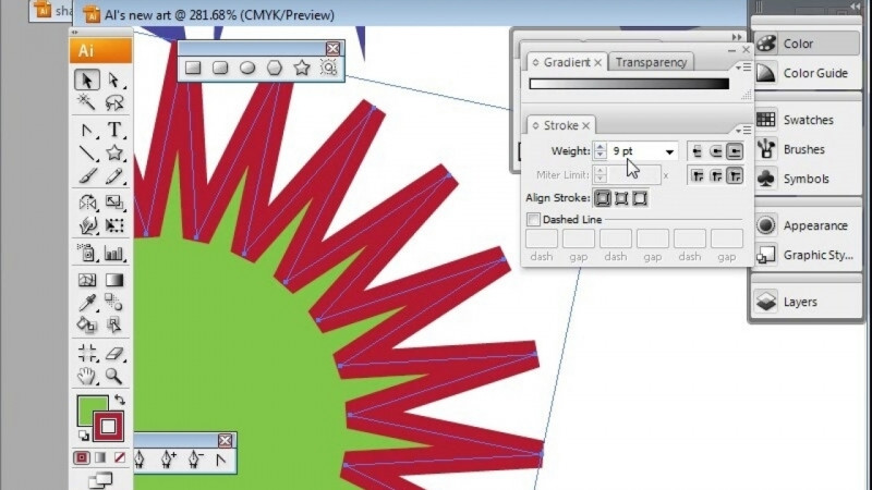
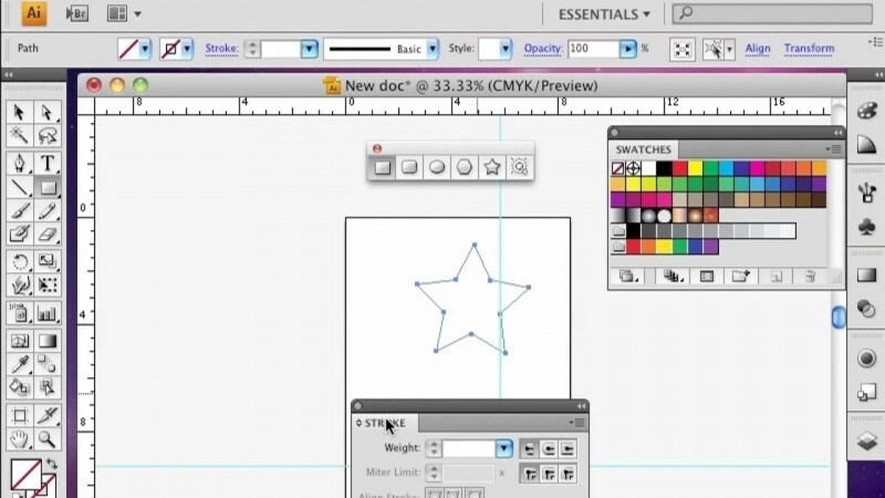
Hello, my name is Steven Steinbach, and in these lessons, we're going to look at intermediate data visualization, tracing, and recoloring. To begin, we're going to start with a radio bar graph. So the first thing I want to do is I want to use guides to center. I want to make sure that my smart guides is selected, and you want to come down here and make sure that that's turned on. Okay, so that way we can know where the center is here, and there we can see the center here. So the first thing we want to do is go over to the column graph, left click and hold and come down to the pie chart tool. And I'm just going to then release, then we're going to put two columns in here, and this is going to be a percentage of 100. So I will do 75 on the first one, and let's do 25 on the second and hit the enter key, not the return key. So now we have this. And the next thing I want to do is I want to change the colors of these. So to do that, select the direct selection tool, left click and hold, and we'll go to group selection tool. And then with that tool, we can now select this here, and we can change the fill color to maybe a blue color. And then we can select the white part here, and then we'll change the fill to none. You'll also want to select it with the black arrow tool, and with that selected, go to stroke and turn the stroke off. And let's see that now. Okay, so we have this, and what I want to do now is create a clipping mask so that this can be updated. And to do that, we're going to select the ellipse tool, and I'm going to just change the color of that. I'm going to shift select that with that selected, I'll change the fill color to something else like that. And then with the black arrow tool, I'm going to hit the alt key and duplicate that. And I'm going to just shift and scale that down a bit. And now we want this to be centered right there. Select these two with the shape builder tool, we will use the alt key to subtract this center. Next we're going to center both of these, so we're going to take this to the center, and then we'll center that as well there. And I'm going to just scale that down a bit to about there. So once that's created, we're going to create a clipping mask. And to do that, we'll go to layers, we'll select the layer here, and click on the options, make clipping mask. What's nice about this technique is if I want to change this now, I can always do that by clicking on the graph, hitting the alt key, and then with the numbers here, if I wanted to change the values here, let's say it's 40 here and 60 here. And I hit enter, that updates. In the next lesson, I'm going to show you how to create a donut bar graph. Thanks for watching.