Enjoying the preview?
This is the free first lesson. Get full access: request a demo or sign in.
Enjoying the preview?
This is the free first lesson. Get full access: request a demo or sign in.
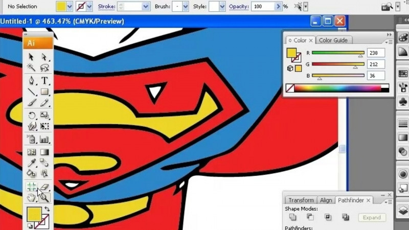
One of the most satisfying aspects of logo design is developing a proper color palette—but it’s wise to research color design principles before committing to specific hues. Adobe Illustrator has several useful tools for color including swatches, color guides, and specialty tools that can take your logo design to the next level. However, it’s also important to understand the ramifications of using two or more colors, as well as the differences between designing for print vs. digital, so you get the most accurate color interpretation for your brand logos.
In these lessons, we’ll explain why color choice matters in a logo and how to research and develop a color palette for a brand. You will discover how to utilize the Swatches panel in Illustrator, and we’ll go over some of the more advanced color tools, along with how to separate colors for the printing process. We’ll also go over the difference between CMYK, RGB, hex colors, and spot colors.
It explains why color choice matters in a logo, how to research and develop a color palette for a brand, how to use the Swatches panel and advanced color tools in Adobe Illustrator, how to separate colors for printing, and the differences between CMYK, RGB, hex colors, and spot colors.
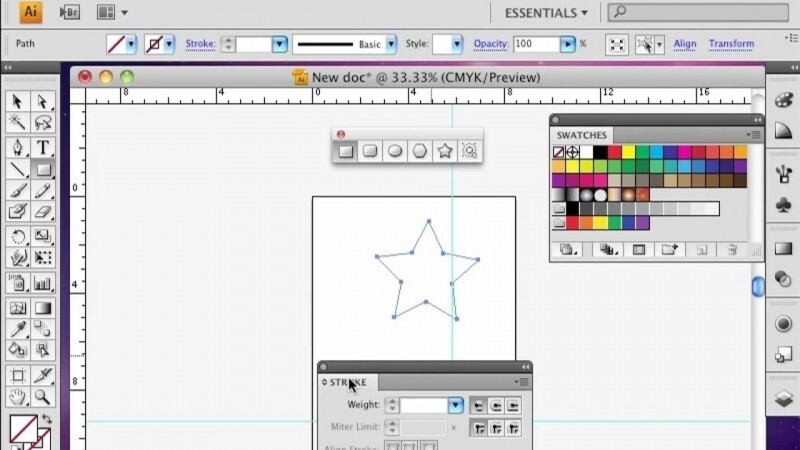
The course uses Adobe Illustrator and its color tools, including swatches, color guides, and specialty color tools.
You will gain skills in color grading, color management, color mixing, color palette development, color printing, and using color tools.
Yes, it covers the differences between designing for print versus digital and how to separate colors for the printing process so you get the most accurate color interpretation for brand logos.